tt-rss dfm
i am a massive consumer of syndicated web feeds. This allows me to collect and filter web content in digest mode without need for maintaining and visiting bookmarked pages of web sites of interest. Over time, close to 300 feeds have been collected spanning a variety of topics organized into categories. Tiny Tiny RSS or TT-RSS handles these feeds with aplomb, filtering on content and, more importantly, allowing organization and presentation of the digests in a distraction free mode or dfm. With this much content, every measure to reduce visual noise renders the browsing experience less fatiguing and more efficient.
chalkface
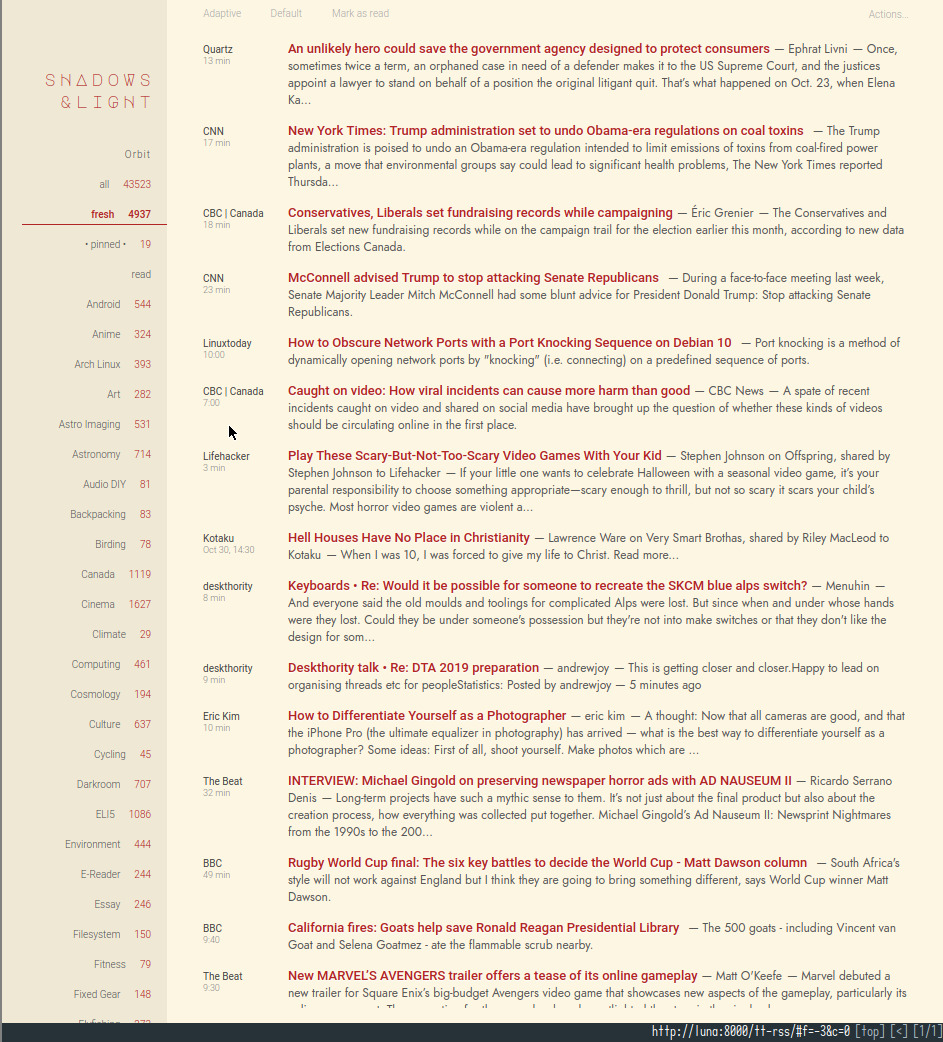
my original TT-RSS theme was a heavily modified CSS script based on the Chalk Theme..

TT-RSS updates after version 17.4 broke this theme and, hence, my version of it. So for many years, i ran version 17.4 of the TT-RSS server. There was nothing compelling enough to motivate upgrading the server so all the tweaking i did over the course of this time was focused on fine tuning the theme itself in pursuit of the visually cleanest theme possible (pour moi).
feedly
covid-19 arrived and with that, time to revisit TT-RSS and consider upgrading, given the larger role TT-RSS assumed in my daily Covid routine. The upgrade only required unpacking the most recent source files and initializing a fresh database—i was not concerned about retaining old starred articles. Only finding a suitable TT-RSS theme remained.
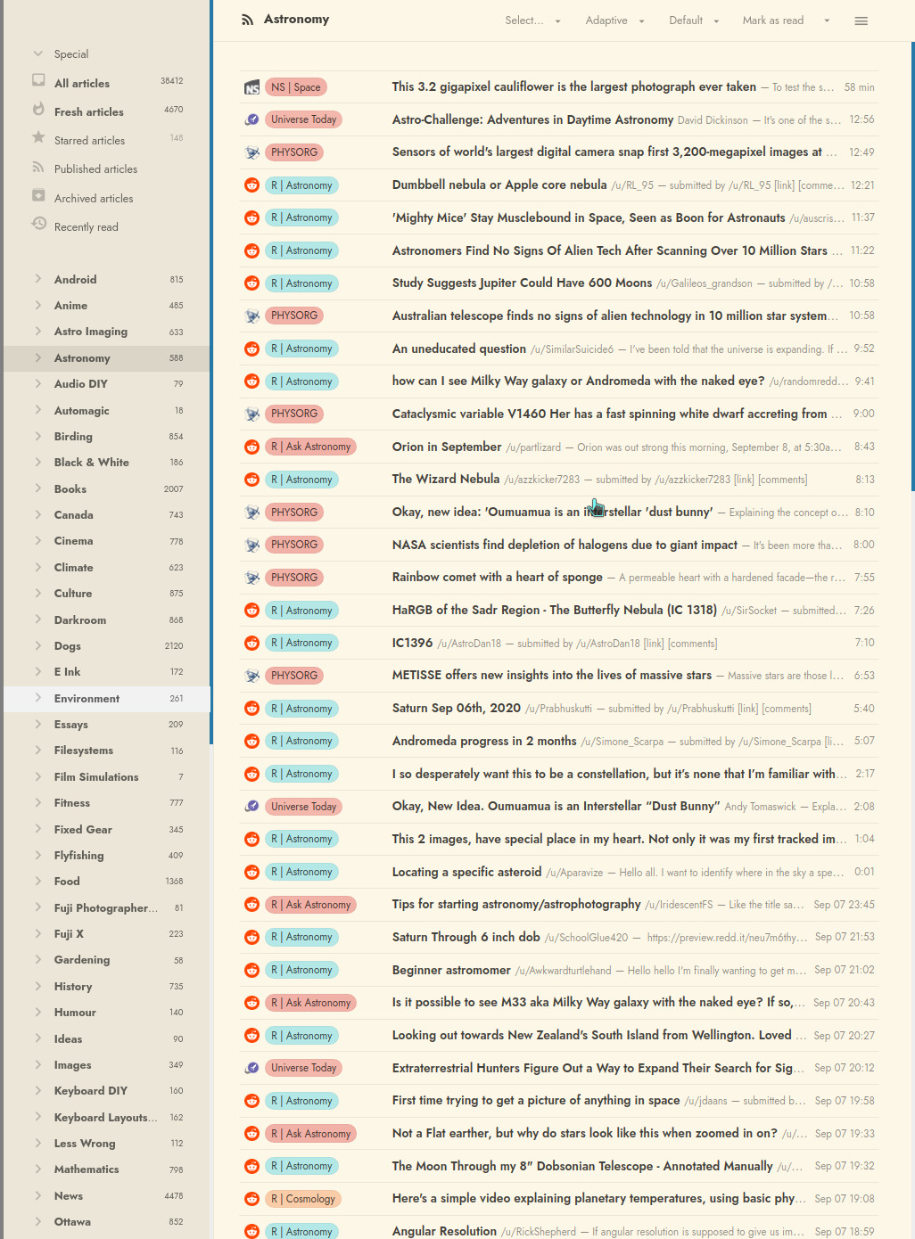
Enter the Sepia Feedly Theme which looked remarkably close to my modified Chalk Theme as a candidate for tweaking..

It is relatively clean (compared to the default TT-RSS theme on installation). But is still too distracting for my eyes with its highlight colouring and bold category headings; plus, its digests were severely truncated.
css stylesheet
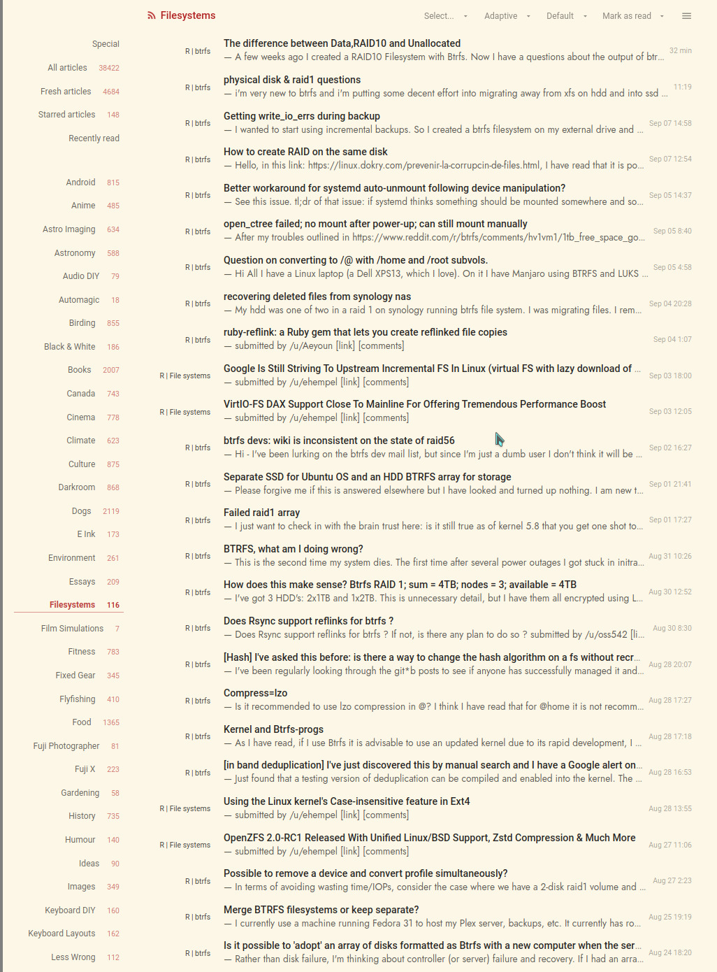
these quibbles are solved by inserting a custom css stylesheet wrapper via TT-RSS Preferences / Customize (no need for branching the Feedly source this time around!) to yield this dfm theme..

Main differences to the original modified Chalk Theme include..
- no TT-RSS home page title
- no modified Special subheading labels (requiring modifying php source)
- right justified feed source names
- full single line digest
- right hand date
- highlighted starred entries with red titles (not shown) omitting the star (.png image)
Qutebrowser is my main browser and is configured with keybinds for navigating TT-RSS. So, keyboard driven, additional changes to the Feedly Theme include..
- removal of unused Special subheading labels (features i do not use)
- removal of pop-up tags for Starred, Published, etc.
While the multi-line digest of the original Chalk modified theme was a unique feature amongst TT-RSS themes, the above changes were achieved with a substantially smaller and easier to maintain CSS wrapper, the resulting design, of which, is sufficiently informative and even cleaner visually, all the while presenting a page with maximum feed content.
aligned feeds
after several months with the custom Feedly stylesheet, i widened the feed list width and changed the min-width counter to a left aligned fixed width element, from..
.ttrss_index #feeds-holder { width: 135px !important; top: 55px !important; padding-bottom: 55px !important; }
.ttrss_index span.counterNode { color: rgba(177,37,37,.6) !important; font-size: 10px !important; padding-left: 10px; margin-right: 6px !important; margin-top: 0 !important; min-width: 5px !important; border: none !important; line-height: 22px !important; height: 20px !important; }
to..
.ttrss_index #feeds-holder { width: 150px !important; top: 55px !important; padding-bottom: 55px !important; }
.ttrss_index span.counterNode { color: rgba(177,37,37,.6) !important; font-size: 10px !important; padding-left: 10px; margin-right: 6px !important; margin-top: 0 !important; width: 15px !important; border: none !important; line-height: 22px !important; height: 20px !important; text-align: left !important; }
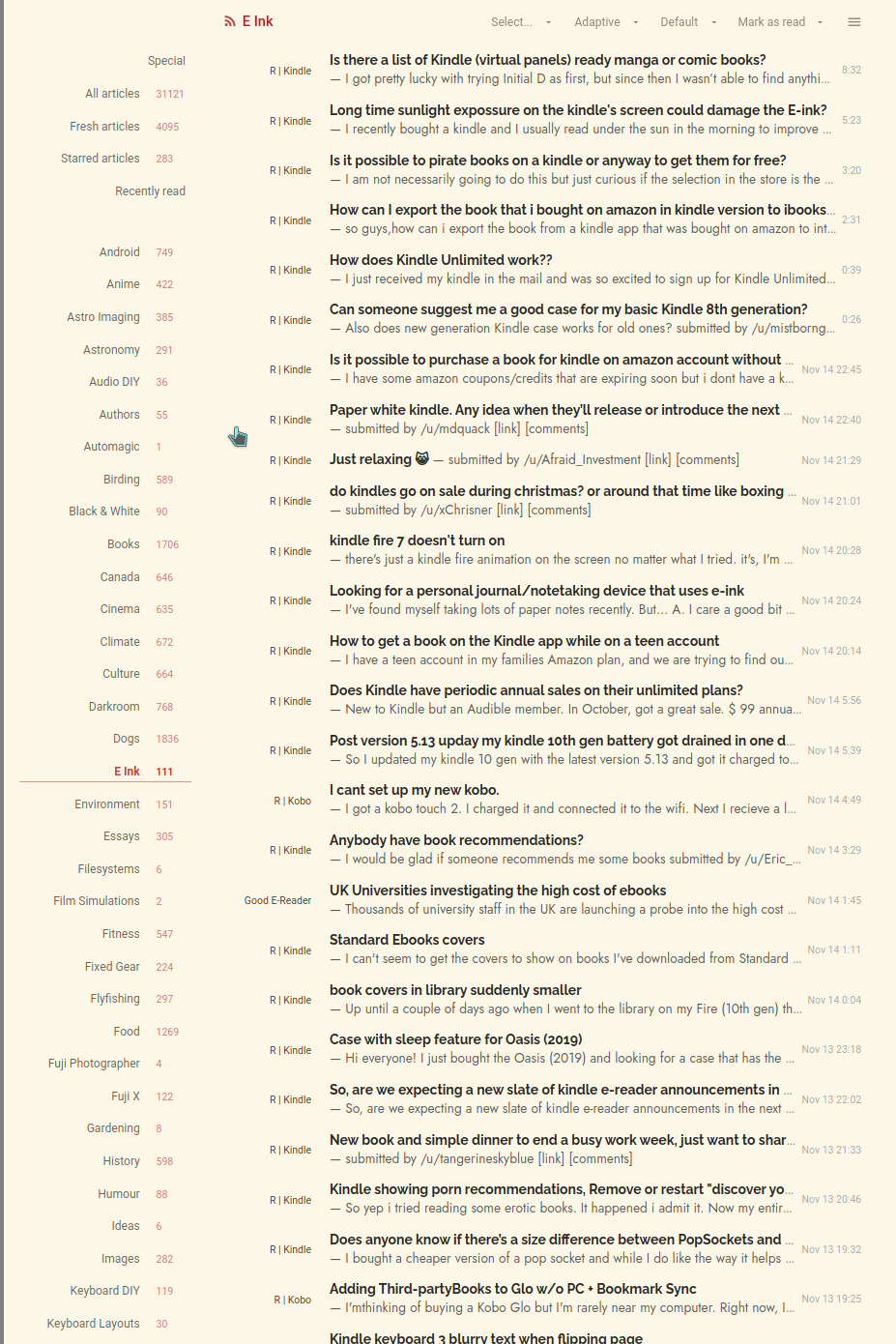
to yield a subtle but more columnar presentation..

Due to empty counter node values for read feeds resulting in the feed labels being right shifted over the feed count column (such as happens with the Special and Recently read labels), this theme variant looks best if the TT-RSS Preferences are set to “Hide read feeds”.
A matter of taste but i rather like the feed count column left aligned to the feed labels for its mirrored symmetry. Each to their own :-)